
Project Type: Concept
Programs: Illustrator, Photoshop
Skills: Layout Design, Wireframinig, Visual Design
Status: Finished
Origin Game Client Redesign
About
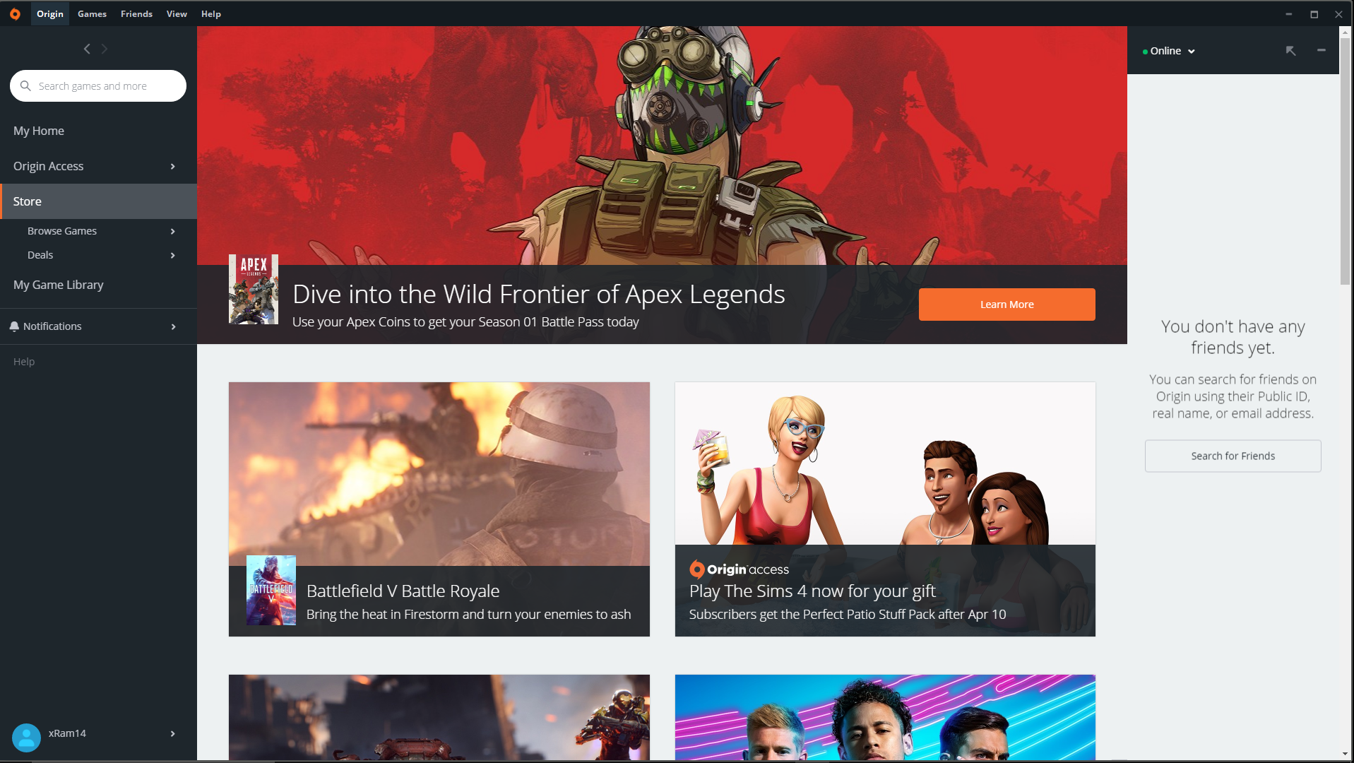
This is a redesign concept of the Origin game client, specifically the store and game info page. Origin is a game client of gaming Publisher Electronic Arts and competes with other game clients like Epic and Steam. I was inspired to do this concept after seeing a redesign idea of Steam's client
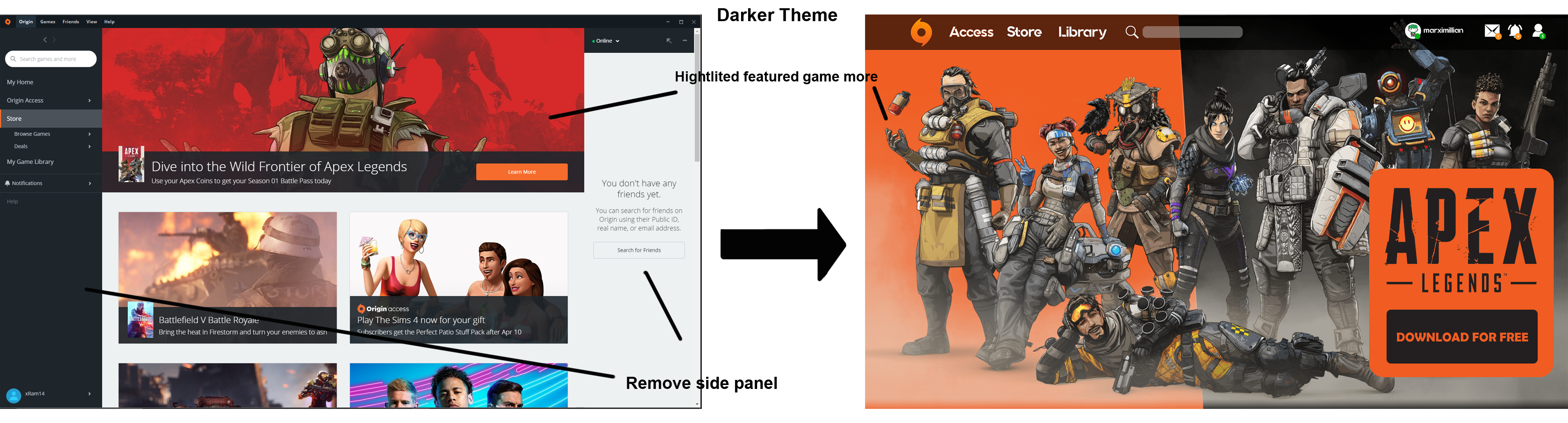
A reason why I think Origin should consider redesigning their online Store is because I think it behind Steam's design. Steam's client doesn't feel as clutter and is also more visual appealing in my opinion. I've seen a poll where users have preferance of darker themes vs light themes such as the Origin one.
Design
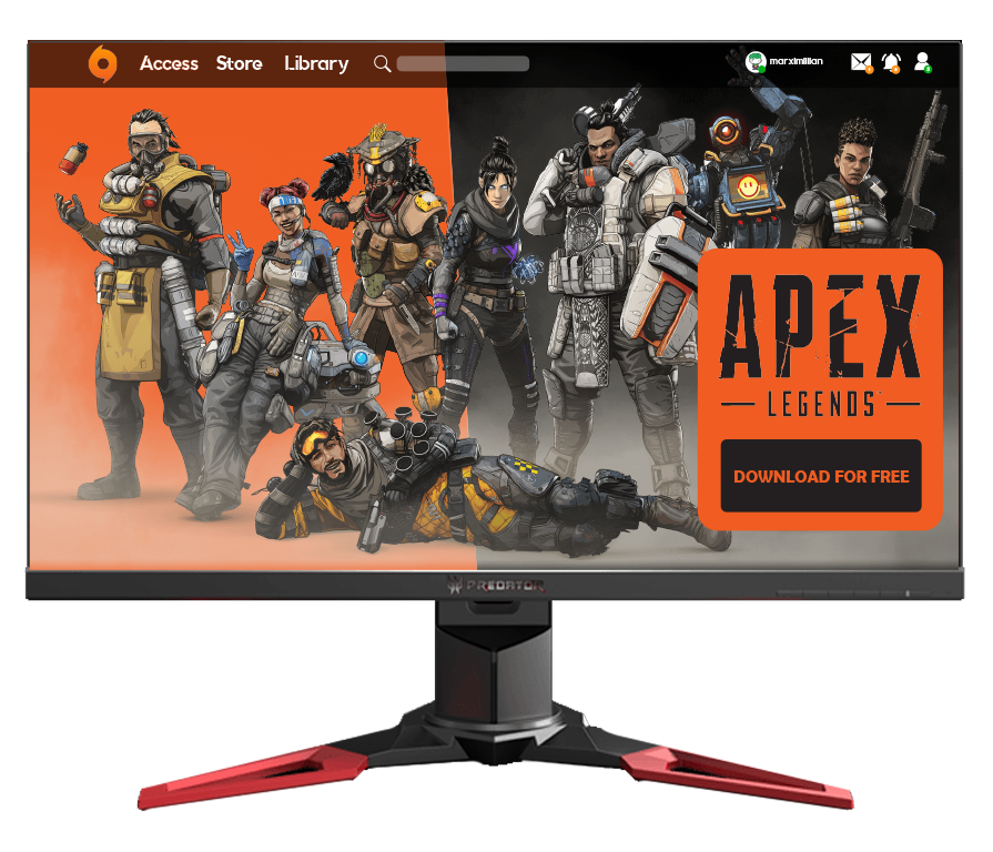
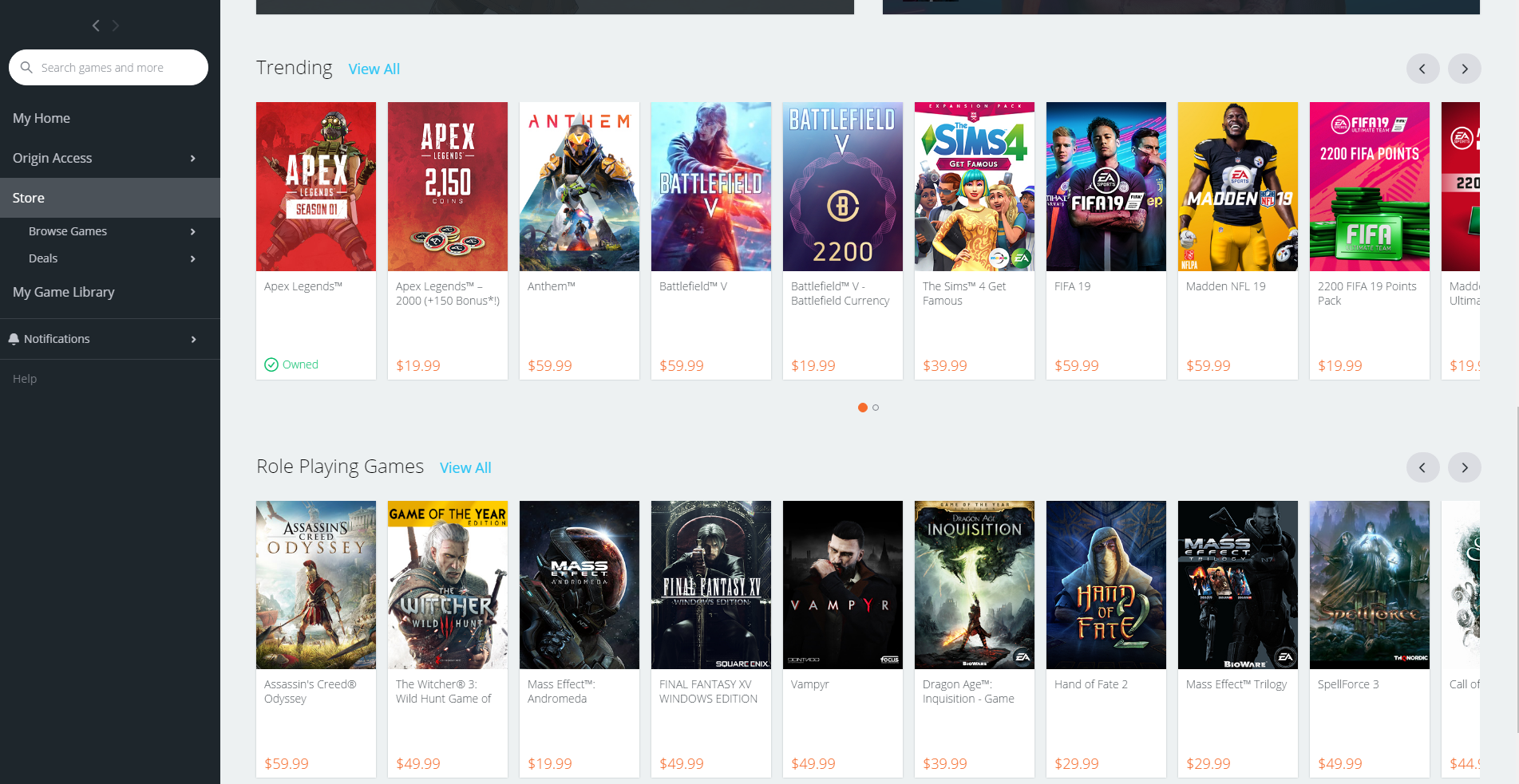
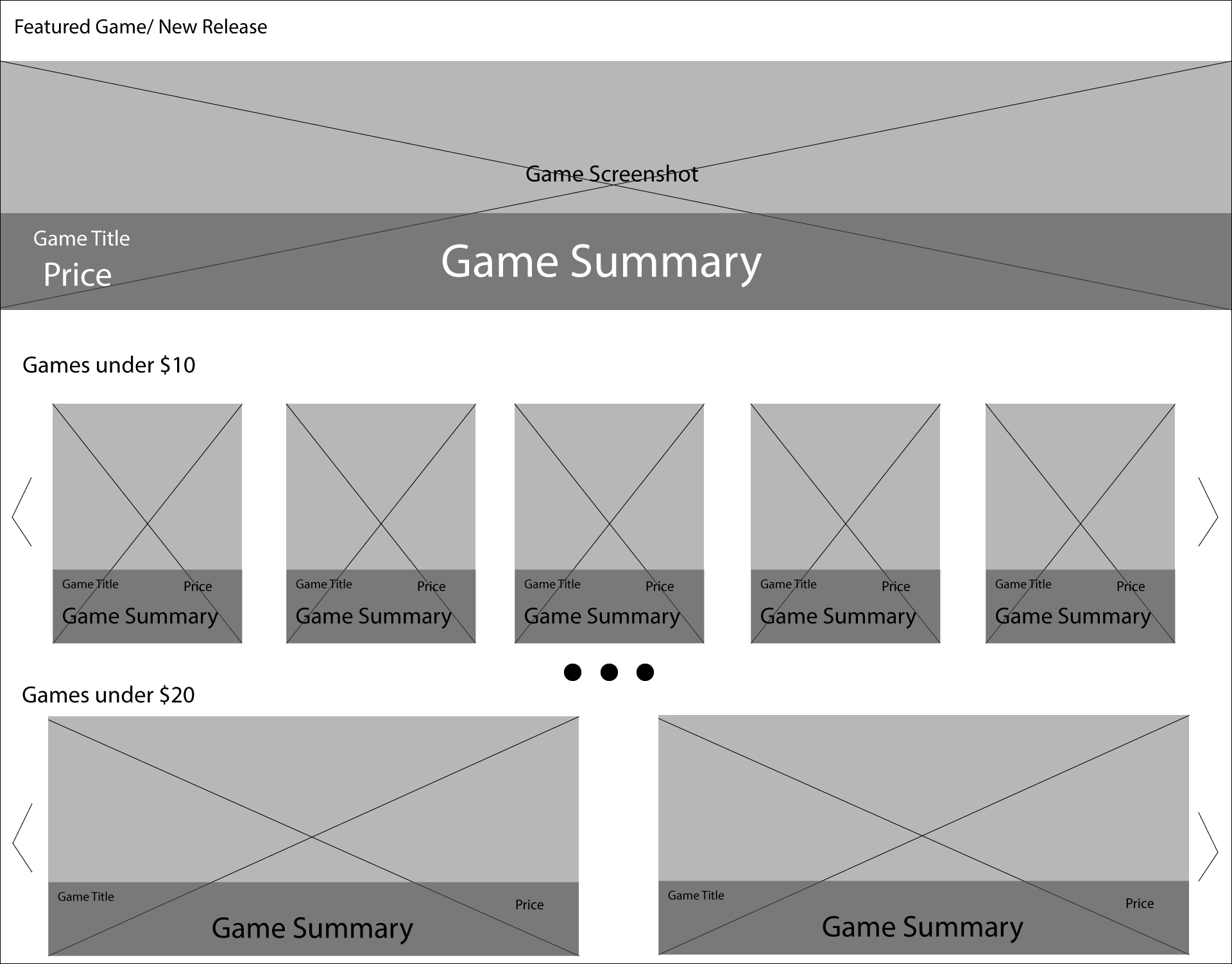
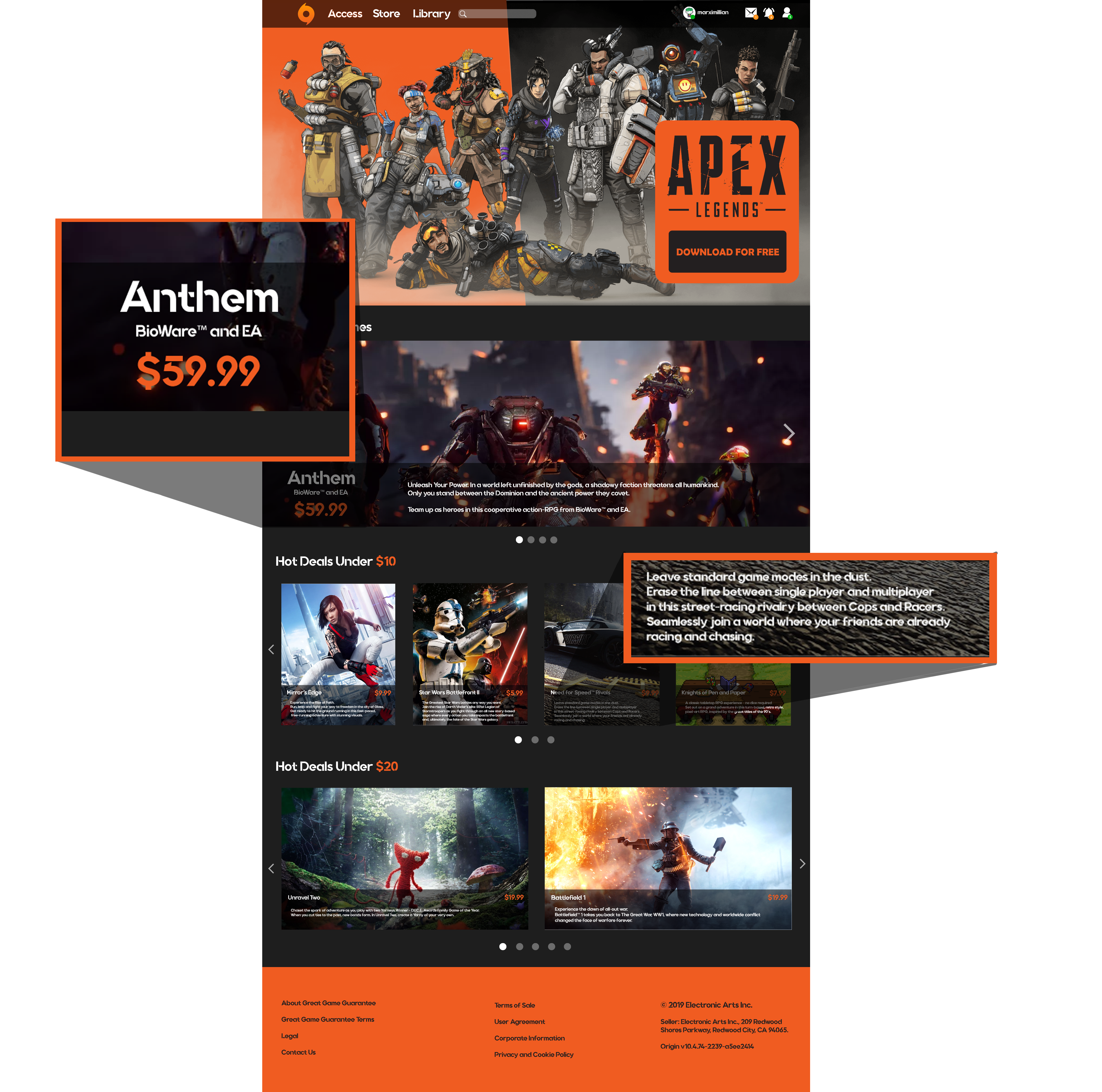
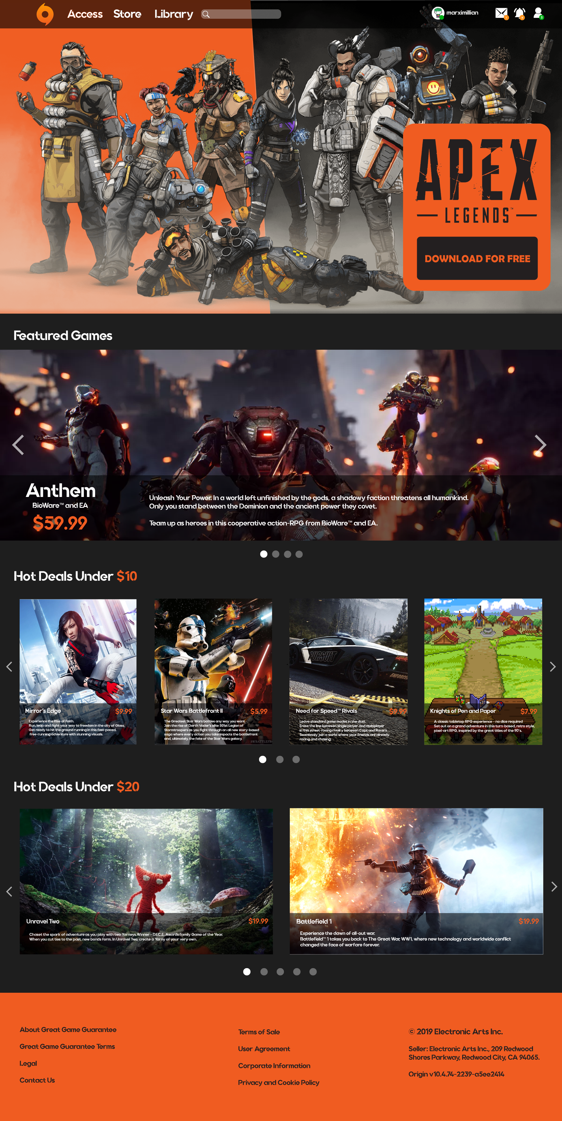
For the landing page, I wanted to showcase the biggest game of Origin front and center. I also wanted to get rid of the permanent sidebar that the client have. I feel like this is unneccessary and can easily be implented in the menu.
I included the deals page into the main page, which are the "Games Under $10" and "Games Under $20". I feel like if a company if having a promo, its best to show it up front to the customer.
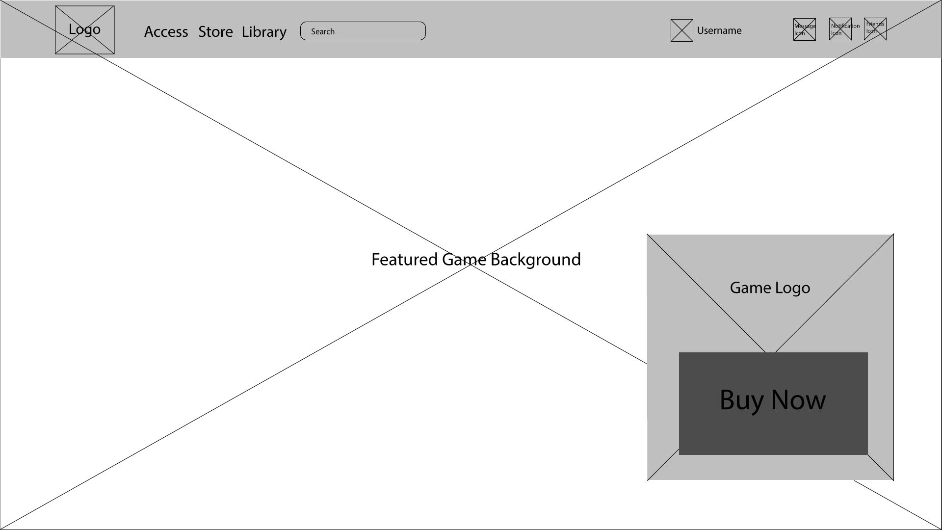
For the color scheme I wanted something that I think would appeal to gamers. As an avid gamer myself, I went with having a dark color as the primary color and a brash color as secondary color. The secondary color is tint of orange that is found is prominent in the Origin and I used it to highlight important info like notifications and game prizes.

Implementation
My idea for the revision is to make the theme of client more visual appealing and less compact. I wanted to highlight the information that I think that are important and make the page easier to navigate for someone new to the client.
User Friendly
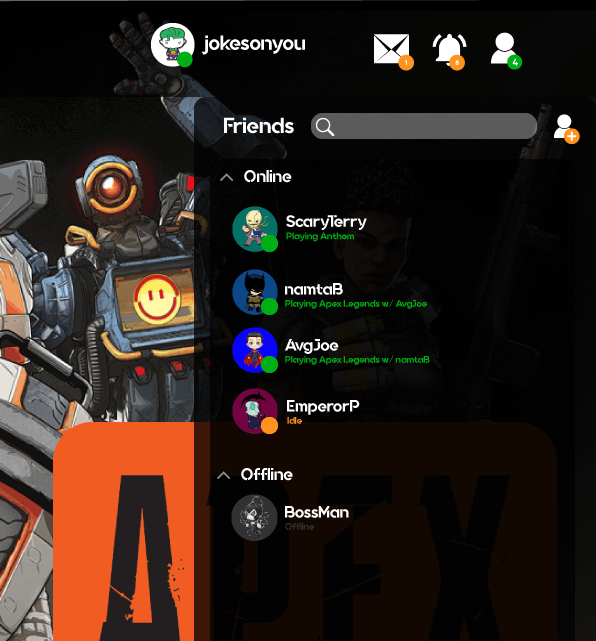
I also decided to redesign the friends list for my concept. I strongly feel that the way steam handles their friendlist is a standard that other companies should try to replicate.
For my design, I added a drop down panel on the menu, for easy access to user. I also highlighted their current status, whether they are idle or playing a game with a mutual friend.
Easy to Navigate
Deals are shown on the main page, while showcasing featured games
Deals are shown on the main page, while showcasing featured games
Access to Game Info
Consumer won't have to click on a game title, and load a game page to get a premise of what the game is about.
Consumer won't have to click on a game title, and load a game page to get a premise of what the game is about.
Consistent Theme
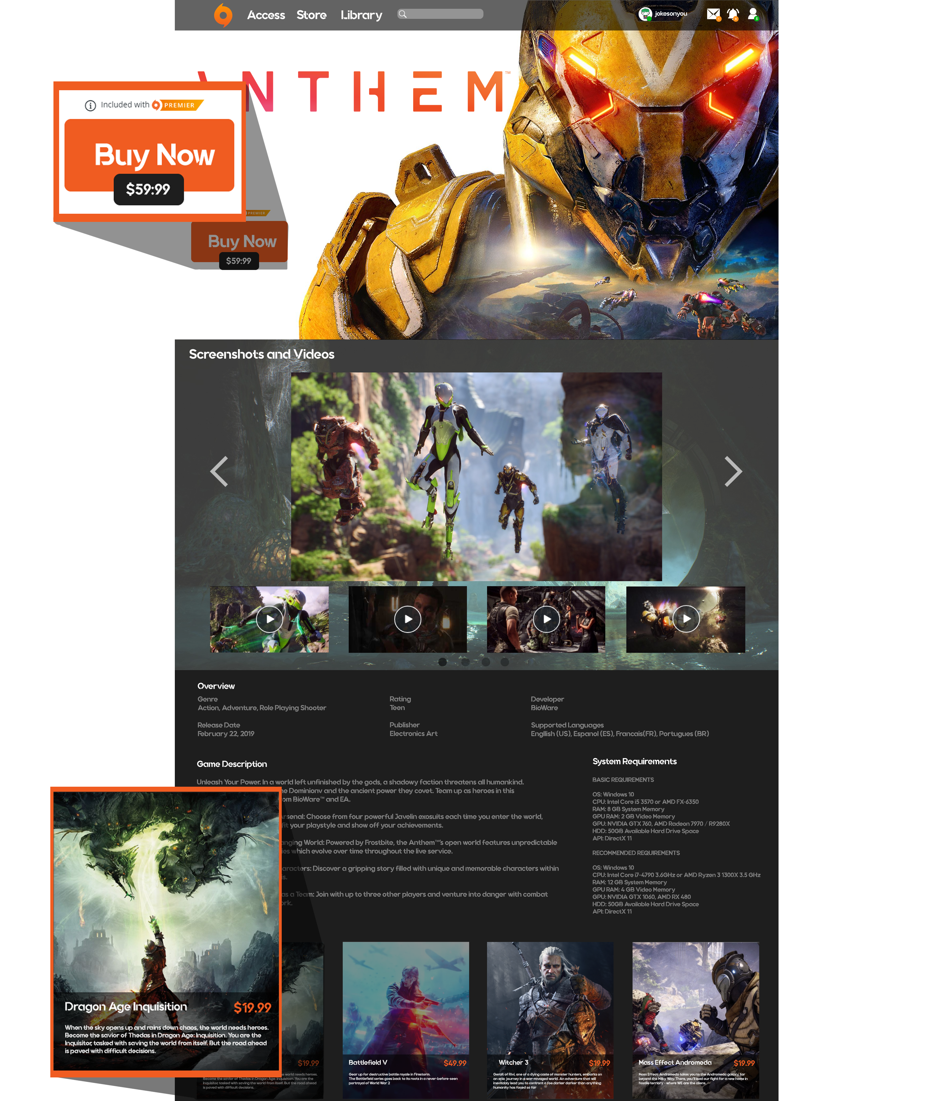
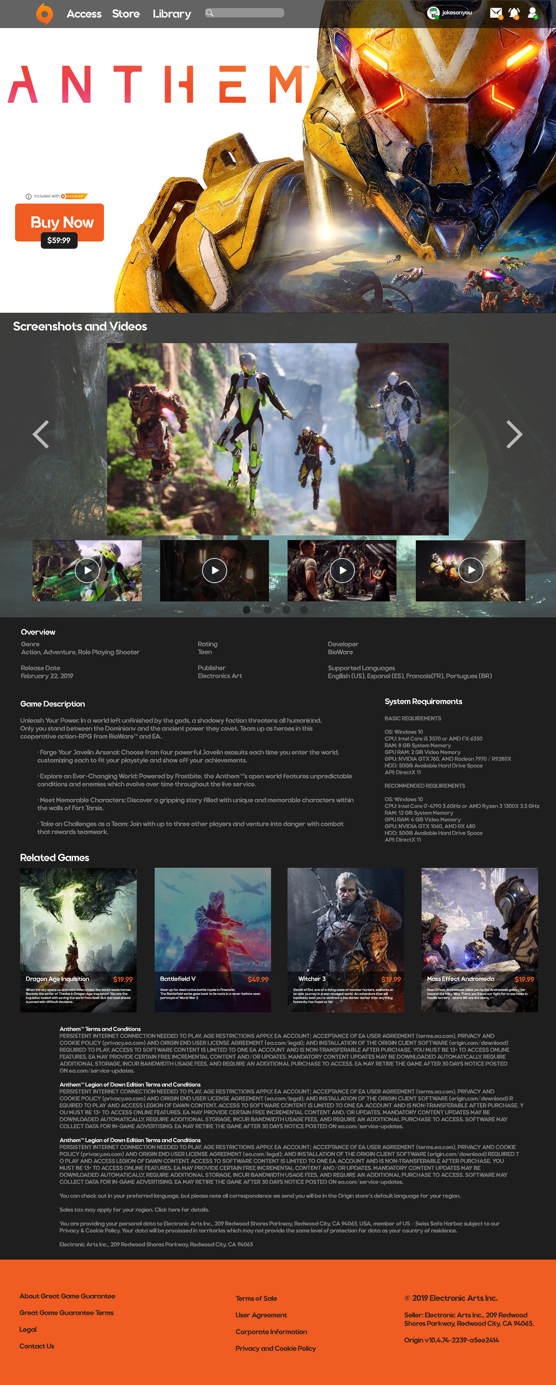
The color scheme, and design layout are universal from the homepage store to the game description pages.
The color scheme, and design layout are universal from the homepage store to the game description pages.
Removed Large Clutters
The original game description page in Origin contains a lot of large images that covers the entire page that has small description. It makes scrolling down to system requirements, features and game summary take a long time. In my design I cut out those large images, and place them in the media section.
The original game description page in Origin contains a lot of large images that covers the entire page that has small description. It makes scrolling down to system requirements, features and game summary take a long time. In my design I cut out those large images, and place them in the media section.
Concept


© Marx Bacungan